Wednesday, January 27, 2016

Dr. Martins Concentrated Watercolors

As mentioned in previous posts one of my favorite mediums to work in is Dr Martin's Concentrated Watercolours. I was introduced to these in one of my illustration classes in college and have loved using them ever since.
Dr. Martins are sold in sets of various colors, but I always found it easier just to use primary colors and mix everything. Using Scarlet Red, Lemon Yellow, and True Blue, I can pretty much create any color I need and it has taught me tons about color theory along the way. Here's some more examples of pieces I've done in that medium. The thing I love about them is the fluidity of them and some of the weird effects you can do.....here's one of the first pieces I did with them.
Here's some more pieces from over the years of various styles but all in Dr. Martins (and Microns and Bombay black ink for lines in some cases)
and my most recent piece that I just did the other day......
For my highlights I either do one of three things. 1. If I can plan far enough ahead, use masking masking fluid to brush over where my highlights would be, paint over it and then peel up when I'm done leaving the white of the untouched surface. 2. Depending on the surface I'm painting on going in with bleach and a brush and "painting" in my highlights. This doesn't seem work on watercolor paper (probably because of the absorption ), but seems to work really well on different kinds of illustration board. 3. Just use titanium white paint and paint my highlights in. p.s. Be sure and get a UV fixative spray. One of the things about Dr. Martin's is they fade pretty quickly if left in direct light or sunlight unsprayed. But fixing them and if you get them framed putting them under UV glass helps protect them. As a precaution, If a piece is small enough, I make sure to scan them as soon as they are sprayed and if I think I might want to make prints down the road.

Monday, January 25, 2016

Comic books and sketch covers

As a kid, I LOVED comic books and was obsessed with them. I remember from time to time my dad coming home from work and handing me either packs of trading cards (usually from Star Wars or other movies) and comic books - in most cases Batman's various series including the obvious self-titled one, but also Detective Comics, and Brave and the Bold. This era of Batman will always be my favorite visual era of him - the cobalt blue, gray, and yellow version.
In the mid-80's my love of comics kicked into high gear and shifted to Marvel when Spider-man got his black alien symbiote costume. In fact I remember the specific comic book that ushered in a new era of comic love for me - Amazing Spider-man #254. I didn't know anything about Secret Wars and missed the issue where Spider-man returned with his new suit, so it was just a total surprise to me. I just remember thinking the new suit looked cool as hell and I HAD to have that comic to find out what was going on.
Around this time, 1985-86, my dad was the manager at Hauer Music on Far Hills in Kettering, and there was a Gray's drug across the street that had baseball cards and down the street was a pharmacy that had a ton of comic books. They had one of those spinning comic racks and they used to pack each holder like 10-20 comics deep. This was back when comics were like 60 cents, so if I walked down there with $5 I could get quite a bit including some Big League Chew, Lik-em Sticks, etc. etc. My love of comics continued through high school and switched AGAIN back to DC along with the Batman movie craze of 1989. Around this time my favorite comics were The Killing Joke (favorite comic ever) and Arkham Asylum and a lot of my work at the time revolved around Batman, and the Joker. This was also around the time that I found Maverick's in Kettering (I lived a sheltered life) and walking in there gave me the same feeling I'm sure some people do when they walk into a church - you know, like a choir singing, warmth, and stuff. Unfortunately it wasn't within walking / bike distance of my house or Hauer Music so going there was a rare thing, but that made it more special. 
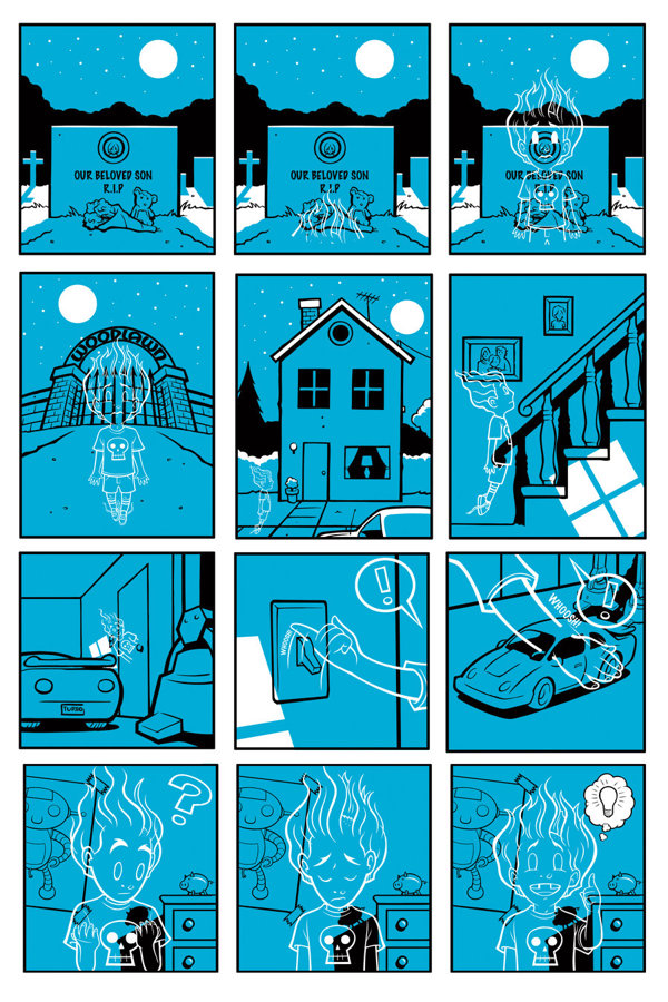
When I went off to college, finances and the overwhelming "newness" that goes along with being thrown into a whole new experience made me lose interest in comics. Every once in awhile I would pick up a copy of Wizard so I still knew what was going on and from time to time would get special issues (Alex Ross' Marvels, The Death of Superman, Batman Knightfall, etc.). Also, around this time my friend Hoffa introduced me to independent comics like Milk and Cheese, Reid Fleming, and others. Although I wasn't buying as many comics, during this time I thought that maybe drawing comics was something that I wanted to pursue, even taking a comic book drawing class in college. Well I quickly realized I wasn't cut out for drawing comics for a couple of reasons. I LOVE consistency and in the one and two page exercises we were doing I could see my interest not only start to wane, but also the consistency of my artwork. So it dawned on me that a 30 page comic would probably make me have a nervous breakdown. Nowadays after having a few lengthy projects under my belt that might not be the case but I just remember at the time think it wasn't what I wanted to do and if I was to contribute to that industry it would have to be as either a cover artist or just doing pin-ups. A number of years later I did a 4 page comic for an anthology series called Faesthetic and actually had a lot of fun with it. They have a theme for each book and in this case it was "ghost story". My approach was a little twist on a whole avenging spirit Tale from the Crypt type story....
While my career has taken me in a lot of different directions , I think deep down I still dream of doing something related to comics but also think any chances I had to board that ship have probably passed me. But doing sketch covers has allowed me to act out some "What If?" scenerios with some of my favorite comic properties. For people that don't know , sketch covers are comics with blank covers sold to the public that artists can draw on. Here's some of the various covers I've done over the past year and I still have a huge stack of blanks. I even ordered some new Walking Dead ones that I should be getting this week...so be on the look out for more.

Friday, January 22, 2016

Daddy Kool's Record Store day 2015 shirt / process

For the last couple years I've created a shirt design to mark Record Store Day at Daddy Kool Records, located in St. Petersburg, FL. Robbie Fuct, who I've known for awhile through Gigposters.com and hours and hours of playing Call of Duty (PEW PEW) will come to me with an idea, sometimes specific and sometimes sort of vague that we'll develop into a shirt design. For the first year the theme they wanted was something evocative of Public Enemy....
For the second year, the theme was something Joy Division inspired as the event was to coincide with a Peter Hook (bassist for Joy Division and New Order) performance going on that night across the street. I've been a fan of New Order for a long time...strangely I was introduced to New Order before Joy Division which I love as well, when they used to play Bizarre Love Triangle all the time at Mean Mr. Mustards in Columbus (RIP). So needless to say I was pretty excited about this. First off, sometimes, it's not a good idea to just skim a message about a job, because in this case I misunderstood the connection to Peter Hook. What I thought was that he was going to be doing a performance AT Daddy Kools, so in my mind I saw him performing a stripped down acoustic set in the store rather than a full fledged show later on that night. My first sketch kind of reflected that. My memory of Peter Hook in New Order videos was of him hunched over his bass...and going n that direction I thought it would be cool to make him literally look like a human hook shape....
They (Robbie and his bosses) liked the sketch but wanted there to be more of a visual connection to Joy Division.....there's the obvious Unknown Pleasures album cover / t-shirt design that's kind of been done to death in recent years but there's also a ton of other imagery associated with Joy Division to draw from....while trading different imagery back and forth Robbie sent me this cover to their Love Will Tear Us Apart 12" and I knew this direction would be right up my alley....I mean c'mon, it's an angel.
For my first sketch I went a little too literal, although the idea was to make the angel from that cover look as though she is laying on the floor listening to records on some headphones....
They liked it, but we both agreed it didnt have to be so literal and could instead evoke the angel on that cover, but not be a copy of her....so I did another pass with a live human and this also allowed me to incorporate that Unknown Pleasures design shirt design into it.
After that was approved I took it to final - hand drew the line art and colored (greyscale) in Photoshop.
Coolest part was getting a pic sent to me of Peter Hook wearing the shirt at his performance that night.....

Monday, January 18, 2016

I miss you C2 / 4FRNT

Today I found myself thinking about the old C2/4FRNT art space I shared with a couple friends of mine. Back in 2006, when I moved back to Dayton from Columbus, I scrambled to find my way into the art scene here. I already knew a few people here, but not being a very outgoing person, it was very awkward to say the least. I eventually got into contact with local artists name Germ and his friend Jeffie Richards who ran a small space called C2 in the Front Street Warehouses and they invited me to submit a piece or a show titled "Bicycle Built for Two". First off, I have too subject matters that I know of that are "Kryptonite" for me - horses and bicycles. There's something about horse heads that mess with my brain and when I look at bicycles, it's like when someone asks me a math question real quick - my brain just has a freak out. I figured out a work around by basically painting a bicycle accident where the rider is ripped in half and his bike is in pieces.....
I continued to be invited to various shows and even though I don't remember the actual chain of events started going down there to paint. The way I describe going to that place is like the one episode of Seinfeld where George finds that secret club filled with super models but from the outside looks like a meat packing warehouse. Through shows at C2 I ended up meeting a lot of great people and creating friendships along the way including my friend Mike Guidone who owns Monkeybones Tattoo in Beavercreek. Around 2010 there was a little kerfluffle and we lost the space for a couple months but then Mike, Jeffie, and I took it over renaming it 4FRNT. With the help of different people including Mike's wife Tabitha we continued to put shows on there until we sadly shut it down in July of 2012. I really miss just having a space like that to put on some music, hang out with my friends, and make art. Being kind of an empath I feed off the energy of being around other artists and working in a solitary fashion can really be difficult sometimes. Anyway, pouring out a little Mad Dog 20/20 for 4FRNT...miss you buddy.... Here's some pictures from various shows over the years.... unfortunately we were usually too distracted to get pictures of the actual crowds but we used to pack that place.....I would like to thank Mary Kathryn Burnside at Clash Consignment for carrying the torch of fun group shows in Dayton...I really consider what she does there to be the spiritual successor to what we were trying to accomplish at 4FRNT.

P-4!

I can't remember the exact year, but back when the whole designer vinyl craze was ramping up I was asked to be part of an artist created series of characters that would be produced using PVC plastic. Unfortunately the project eventually imploded but I came up with this little guy I dubbed P-4 ( short for Power Plug Pee Pee ). I think he's pretty self explanatory...incidentally enough I had been working on some sketches for a guy on another project and he pulled the whole "if this works out, we'll get to work on a bunch of your personal projects", which I've heard before. Its a game people play when they want to get stuff either cheap or for free. But I showed him P-4 and right off the bat he was wanting to change the shape of the mouth and most stupidly take off the plug to make it more "kid friendly".....it was then that I realized he didn't "get it" and would essentially be negating the point of the character. One day I hope to see him realized as an physical object, but in the meantime here's some drawings of him over the years as well as his female counter part - SC. I'll let you guess what that stands for.
Some variant paint schemes including a C-3PO version