Showing posts with label watercolor. Show all posts

Wednesday, January 27, 2016

Dr. Martins Concentrated Watercolors

As mentioned in previous posts one of my favorite mediums to work in is Dr Martin's Concentrated Watercolours. I was introduced to these in one of my illustration classes in college and have loved using them ever since.
Dr. Martins are sold in sets of various colors, but I always found it easier just to use primary colors and mix everything. Using Scarlet Red, Lemon Yellow, and True Blue, I can pretty much create any color I need and it has taught me tons about color theory along the way. Here's some more examples of pieces I've done in that medium. The thing I love about them is the fluidity of them and some of the weird effects you can do.....here's one of the first pieces I did with them.
Here's some more pieces from over the years of various styles but all in Dr. Martins (and Microns and Bombay black ink for lines in some cases)
and my most recent piece that I just did the other day......
For my highlights I either do one of three things. 1. If I can plan far enough ahead, use masking masking fluid to brush over where my highlights would be, paint over it and then peel up when I'm done leaving the white of the untouched surface. 2. Depending on the surface I'm painting on going in with bleach and a brush and "painting" in my highlights. This doesn't seem work on watercolor paper (probably because of the absorption ), but seems to work really well on different kinds of illustration board. 3. Just use titanium white paint and paint my highlights in. p.s. Be sure and get a UV fixative spray. One of the things about Dr. Martin's is they fade pretty quickly if left in direct light or sunlight unsprayed. But fixing them and if you get them framed putting them under UV glass helps protect them. As a precaution, If a piece is small enough, I make sure to scan them as soon as they are sprayed and if I think I might want to make prints down the road.

Saturday, January 9, 2016

Materials

Here's some of the different material / products I use...as far as brushes this isn't all the different types and sizes of brushes I use, but the two brands I use. From left to right: Tuff Stuff Eraser stick. This is basically like the plastic eraser photographed below, but can be sharpened like a pencil to erase tighter areas and create highlights. Staedtler mechanical pencil with .003 lead. I vary what hardness of lead I use in it, but it's usually either 2H or at softest HB. For my brushes I almost exclusively get them at United Art and Education. I'm not too particular about the quality of my brushes, because as I'll get to eventually I use paint that would probably hurt really expensive brushes. Plus thats just added stress.... But I either use United Art's own brand of brushes (red handle) or Black Silver's by Dynasty. The cool thing about the Black Silver's is that all their brushes are the same price no matter how large or small ($2.69 if I remember correctly). I also use Berol Prismacolor Verithin pencils for sketching. I start off with Non-Photoblue to roughly sketch things out, and then tighten up with Indigo Blue.
Next up, the type of paint I use is Liquitex Basics. These are around $5 a tube and I only use primaries - Napthol Crimson, Primary Yellow, Ultramarine Blue, and Titanium White and just mix whatever colors I need. Sometimes a painting will call for a Cobalt Blue, but other than that I like to just mix it. Over the years working that way has taught me immensely about color. But I just love the consistency of Liquitex Basics.....I can't stand the waterier (is that a word? Spellcheck says it is) paints.....
Here's some examples of acrylic paintings I've done with Liquitex Basics.
For my watercolors I use Dr. Martin's Concentrated Watercolors. Same with the acrylics I only use primaries - in this case True Blue, Lemon Yellow, and Scarlet Red. I was introduced to these by Mark Hazlerig, one of my illustration teachers at CCAD. They are more like ink and you can do some really crazy effects with them. For inking I used to use microns but have switched over to using a brush and Dr. Martin's Black Bombay. I used to use other brands of bottled ink, but Bombay by far is the most consistently black ink I've ever used. Solid as hell.
Also real important for using Dr. Martin's inks is their 30 well palettes....easier to mix colors with and you won't waste your ink as much. Even when it dries like seen in the picture you can re-activate it with a little water....
Here's some examples of Dr. Martins pieces I've done over the years...they're cool because they work well tightly and loosely....if you ever use them though, be sure and spray fix them with Krylon UV Fixative as they will will fade quickly if left in direct light for long periods of time.

Saturday, January 2, 2016

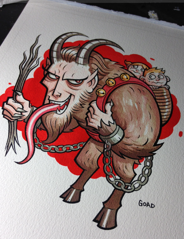
Krampus process pics - Dr. Martins

I'm going to try and show some more process pics of how I work and am going to start off with the Krampus illustration I did recently as a Xmas present for my mom. For this particular piece the materials I used were : Arches 9" by 12" 140 lb. watercolor paper Dr. Martin's Bombay black ink (line art) Dr. Martin's Concentrated Watercolors - scarlet red, true blue, lemon yellow (coloring) United Art and Education brushes #1 and #4 Dr. Martin 30 well palette Krylon UV Resistant fixative spray So first off I needed to sketch out my idea...this piece was kind of a joke one because of how much my mom loves Christmas - but at the same time really seems to like Krampus. But anyway, here's my first sketch and the start of my line art. Rather than just blowing the sketch up and then lightboxing it, I foolishly decided to just redraw it. But then again I'm real skilled at making things tougher for myself than I need to. The trickiest part of course was dealing with the chains. I'm a real stickler for things like that to look consistent.....
Next up I began inking. Unlike working on illustration board or smoother surface, the watercolor paper kept grabbing the brush, so a lot of it was sculpting of lines rather than single strokes. This part of the process always takes the longest, especially getting those little chain links.
Now's when the fun begins. I've said it before, but I usually start off every watercolor piece I do with a way watered down ink splat right in the middle it...you can see some of the collateral damage in the lower left. This is a little psychological thing I started doing a while ago to get me in the right frame of mind to work loosely and more expressively. It's kind of like "Oh , whoops I ruined it. Guess I can relax." (smile). I only use my primaries colors and mix everything. This saves money and will teach you tons about colors. Now I can pretty much think of the exact color I want and know instantly about how much of each primary I need to achieve that. I know some people use those inks pretty much right out of the bottle whereas I make sure I water my colors down a lot. This allows me to build them up and avoid boxing myself in.
For the last part of it - the bright red background behind Krampus, I do use Scarlet Red straight out of the bottle...this is mostly so it looks consistent, something that would be next to impossible if I watered it down.
At this point I spray fixed the entire piece. One of the things about Dr. Martin's is you want to make sure you spray fix your piece with UV spray and if you're going to frame it, use UV glass if possible. I have some older pieces that weren't UV sprayed and hung in places where they were in direct sunlight and faded a lot over time. For this piece, even after spraying it, the red background seemed to bright for me and I pulled it back a little, by brushing water on a section, then laying paper towel on it and picking up some of the ink. Well that's all for the Krampus piece. Next up I'll show how I do my fake woodcut technique using masking fluid. Stay tuned.