Thursday, January 7, 2016
False Starts : Gōds
I've always been interested in the Greek Gods of the Pantheon ever since seeing the movie Clash of the Titans as a kid. To me they were like super heroes and I'm sure a case can be made that there's parallels between DC comics characters, but that's for another time. But at one point in 2009 I was batting around ideas for some new promo postcards. A lot of time I'll get ideas and they'll snowball and snowball to a point where I'm either forced to reel them in or I get intimidated and just scrap them altogether. Growing up I also collected baseball cards and I loved the checklist cards and I also liked when fast food places offered collectible items on a time released basis or had different ones at different establishments. I think the Great Muppet Caper glasses were like that and I found it exciting when a new one came out, because it was exactly that, NEW. Im sure at some point before a new glass was released I had seen each one on an ad or poster, but it was a whole other thing when it was physically in front of you.
But for my promo idea I wanted to pick a small group (mostly because this would get super costly) of companies and art directors I REALLY REALLY wanted to work for and over the course of a year - one every month for 12 months, send them a postcard depicting a different God of the Greek Pantheon. The first one would be oversized and have a checklist. There was a couple reasons behind this, first because as stated above I liked checklists for trading cards and the idea of collectibitity , and second because I hoped it would indicate to the art director that more were to come and not to throw it away.
The plan was to send them in alphabetical order, although maybe over the time I would mix it up....and I really hoped that the art directors would look forward to getting new ones...my devious side even toyed with the idea of withholding a new card one of the months with the hope it would bum them out and then they would feel relief when they started showing up again....but that was probably giving myself too much credit...
So first up would be Aphrodite
Knowing if other work came in I might get overwhelmed I set out to get as many final pieces done as I could before getting them printed. This is where the intimidation began to creep in because I knew if for some reason I burned out it would make me look really bad....but over time I sketched ideas for the different characters and worked on finals...
One of my favorites was Poseidon and I also worked out how I would deal with the back of the cards - a little history about him, kind of like the bio cards on the back of G.I. Joe and Transformers toys.
Who knows maybe I'll revisit this idea - always thought it would be cool to do a series of art prints as well.....
Wednesday, January 6, 2016
Pencil drawings
One of my favorite teachers in college was the late Charles Hall. If I remember correctly, his class was the first one I went to and he taught Basic Figure Drawing. The thing that was great about CCAD was that they were really good about breaking you down and helping to destroy bad habits. I think the main thing that his class destroyed in me was starting off too dark when drawing and instead learning to lightly build up your drawing. To achieve this he had us all start off with extremely hard leads - 6H, 4H, and 2H. 6H is basically like drawing with a nail, but it allows you to lightly get your structure down. Even then he would have us use a kneaded eraser to soften as you went - basically you would sketch, lighten up with your eraser, sketch some more, eraser, sketch, etc etc. It was a long process but it taught me patience and if you did it correctly, your final drawing had this weird sense of reality and ghostliness to it. Most of all it was just a very peaceful way to work..... Over the years my pencil work evolved from shading to crosshatching and eventually I began adding hard lines to stuff to emphasize certain parts and give it a style.
Here's some examples of my pencil work over the years, ranging from realism to stylized.....
Eat Your Art Out Poster process pics
This is an old piece, but still one of my favorites and that says something because I pretty much hate everything I do. In 2011 I was contacted by Jane Dope of The Angel City Rollergirls to create a poster for their yearly Eat Your Art Out charity event. A few years earlier I had contacted them offering to work on a design for a t-shirt - kind of a balance for years of Hell City stuff I guess. But my shirt design ended up being adapted into their new logo.
I also worked on a couple bout posters for them including one inspired by one of my favorite movies, Boogie Nights:
But back to Eat Your Art Out, here's some process pics of the poster I created for them, I had a pretty good idea from the sketch where it was going, so any changes were mostly just small tweaks to the lettering.....if I remember right, there was a venue change at some point....
Tuesday, January 5, 2016
Sad Trombone
Unfortunately sometimes projects will fall through for me for a variety of reasons - something will be cancelled, I'm participating in a "cattle call" with other artists on spec (sometimes to my knowledge, sometimes not) and someone else gets chosen, I'll just get straight up screwed, or there's just a difference of visions.
Here's some things that have fallen through over the years.....
Some helmets I worked on for a company called Scorpion. Why these didnt get made is still a mystery....there's a whole story behind this thing, but I'll kind of leave it be....let's just say make sure you get stuff in writing and also watch who you show ideas to, because you can get ripped off. Sad trombone.
p.s. The three helmets on the left and the upper right were inspired by the movie Aliens. GAME OVER!!!
I was able to use the rear graphic I created for the fiery biomech helmet (middle right side) for other stuff though....
Next up, I was contacted to work on some posters for No Doubt's 2009 reunion tour. All told I was originally asked to do 15 posters, so for about a week I went into an intense brainstorming session coming up with ideas for posters. It was going to be nuts with insane deadlines, but I was ready to go. The only direction I remember there being was Clockwork Orange and 60's futurism. Here's sketches that I came up with....
Response was pretty positive for all the designs except for the skankin' Notre Dame guy and I began to move forward on 4 of the designs.
But unfortunately in the middle of the last two, they decided on a consistent direction for the series (other artists were working on posters as well) and the last two didn't fit into it. So all told only two of the 15 posters ever saw finalization. Sad trombone.
In the future I'll show some other projects that fell through for various reasons and make sure my sad trombone is tuned up and ready to go......
Monday, January 4, 2016
Anarchy Eyewear process
Back in 2012 I collaborated on a pair of sunglasses with Anarchy Eyewear and here's some of the process pics from it.
One other direction was a badass zombie killer lady similar to one I had done earlier for Manglaze nail polish....
Of the three directions, the art director liked the Zombie Killer one the best, so then I started to develop it further...here's some of the ideas I was noodling around with....
Next I inked my lineart for both the bag and the frames
Eventually, after getting the line art inked, I began to work on the computer and experiment with some different approaches for the frames....this was a balancing act between wanting to make my artwork prominent , but not distracting. My concept for the arm graphics was as if you were surrounded by zombies, the reflection of them all around you...one of the options I had was to place the graphics on the inside of the glasses and in the end I decided that was best.
Heres some process pics from the coloring of the bag graphics....
And the final image for the bag....
and the final product....
If anybody is interested, line art for this project is for sale on my shop as well as prints.......
Saturday, January 2, 2016
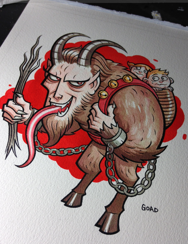
Krampus process pics - Dr. Martins
I'm going to try and show some more process pics of how I work and am going to start off with the Krampus illustration I did recently as a Xmas present for my mom. For this particular piece the materials I used were :
Arches 9" by 12" 140 lb. watercolor paper
Dr. Martin's Bombay black ink (line art)
Dr. Martin's Concentrated Watercolors - scarlet red, true blue, lemon yellow (coloring)
United Art and Education brushes #1 and #4
Dr. Martin 30 well palette
Krylon UV Resistant fixative spray
So first off I needed to sketch out my idea...this piece was kind of a joke one because of how much my mom loves Christmas - but at the same time really seems to like Krampus. But anyway, here's my first sketch and the start of my line art. Rather than just blowing the sketch up and then lightboxing it, I foolishly decided to just redraw it. But then again I'm real skilled at making things tougher for myself than I need to. The trickiest part of course was dealing with the chains. I'm a real stickler for things like that to look consistent.....
Next up I began inking. Unlike working on illustration board or smoother surface, the watercolor paper kept grabbing the brush, so a lot of it was sculpting of lines rather than single strokes. This part of the process always takes the longest, especially getting those little chain links.
Now's when the fun begins. I've said it before, but I usually start off every watercolor piece I do with a way watered down ink splat right in the middle it...you can see some of the collateral damage in the lower left. This is a little psychological thing I started doing a while ago to get me in the right frame of mind to work loosely and more expressively. It's kind of like "Oh , whoops I ruined it. Guess I can relax." (smile).
I only use my primaries colors and mix everything. This saves money and will teach you tons about colors. Now I can pretty much think of the exact color I want and know instantly about how much of each primary I need to achieve that. I know some people use those inks pretty much right out of the bottle whereas I make sure I water my colors down a lot. This allows me to build them up and avoid boxing myself in.
For the last part of it - the bright red background behind Krampus, I do use Scarlet Red straight out of the bottle...this is mostly so it looks consistent, something that would be next to impossible if I watered it down.
At this point I spray fixed the entire piece. One of the things about Dr. Martin's is you want to make sure you spray fix your piece with UV spray and if you're going to frame it, use UV glass if possible. I have some older pieces that weren't UV sprayed and hung in places where they were in direct sunlight and faded a lot over time.
For this piece, even after spraying it, the red background seemed to bright for me and I pulled it back a little, by brushing water on a section, then laying paper towel on it and picking up some of the ink.
Well that's all for the Krampus piece. Next up I'll show how I do my fake woodcut technique using masking fluid. Stay tuned.
Subscribe to:
Posts (Atom)