Showing posts with label paints. Show all posts
Saturday, January 9, 2016
Materials
Here's some of the different material / products I use...as far as brushes this isn't all the different types and sizes of brushes I use, but the two brands I use.
From left to right: Tuff Stuff Eraser stick. This is basically like the plastic eraser photographed below, but can be sharpened like a pencil to erase tighter areas and create highlights.
Staedtler mechanical pencil with .003 lead. I vary what hardness of lead I use in it, but it's usually either 2H or at softest HB.
For my brushes I almost exclusively get them at United Art and Education. I'm not too particular about the quality of my brushes, because as I'll get to eventually I use paint that would probably hurt really expensive brushes. Plus thats just added stress....
But I either use United Art's own brand of brushes (red handle) or Black Silver's by Dynasty. The cool thing about the Black Silver's is that all their brushes are the same price no matter how large or small ($2.69 if I remember correctly).
I also use Berol Prismacolor Verithin pencils for sketching. I start off with Non-Photoblue to roughly sketch things out, and then tighten up with Indigo Blue.
Next up, the type of paint I use is Liquitex Basics. These are around $5 a tube and I only use primaries - Napthol Crimson, Primary Yellow, Ultramarine Blue, and Titanium White and just mix whatever colors I need. Sometimes a painting will call for a Cobalt Blue, but other than that I like to just mix it. Over the years working that way has taught me immensely about color.
But I just love the consistency of Liquitex Basics.....I can't stand the waterier (is that a word? Spellcheck says it is) paints.....
Here's some examples of acrylic paintings I've done with Liquitex Basics.
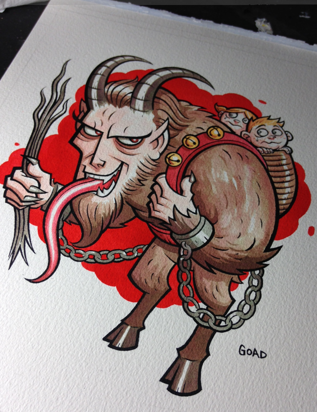
For my watercolors I use Dr. Martin's Concentrated Watercolors. Same with the acrylics I only use primaries - in this case True Blue, Lemon Yellow, and Scarlet Red. I was introduced to these by Mark Hazlerig, one of my illustration teachers at CCAD. They are more like ink and you can do some really crazy effects with them. For inking I used to use microns but have switched over to using a brush and Dr. Martin's Black Bombay. I used to use other brands of bottled ink, but Bombay by far is the most consistently black ink I've ever used. Solid as hell.
Also real important for using Dr. Martin's inks is their 30 well palettes....easier to mix colors with and you won't waste your ink as much. Even when it dries like seen in the picture you can re-activate it with a little water....
Here's some examples of Dr. Martins pieces I've done over the years...they're cool because they work well tightly and loosely....if you ever use them though, be sure and spray fix them with Krylon UV Fixative as they will will fade quickly if left in direct light for long periods of time.
Saturday, January 2, 2016
Krampus process pics - Dr. Martins
I'm going to try and show some more process pics of how I work and am going to start off with the Krampus illustration I did recently as a Xmas present for my mom. For this particular piece the materials I used were :
Arches 9" by 12" 140 lb. watercolor paper
Dr. Martin's Bombay black ink (line art)
Dr. Martin's Concentrated Watercolors - scarlet red, true blue, lemon yellow (coloring)
United Art and Education brushes #1 and #4
Dr. Martin 30 well palette
Krylon UV Resistant fixative spray
So first off I needed to sketch out my idea...this piece was kind of a joke one because of how much my mom loves Christmas - but at the same time really seems to like Krampus. But anyway, here's my first sketch and the start of my line art. Rather than just blowing the sketch up and then lightboxing it, I foolishly decided to just redraw it. But then again I'm real skilled at making things tougher for myself than I need to. The trickiest part of course was dealing with the chains. I'm a real stickler for things like that to look consistent.....
Next up I began inking. Unlike working on illustration board or smoother surface, the watercolor paper kept grabbing the brush, so a lot of it was sculpting of lines rather than single strokes. This part of the process always takes the longest, especially getting those little chain links.
Now's when the fun begins. I've said it before, but I usually start off every watercolor piece I do with a way watered down ink splat right in the middle it...you can see some of the collateral damage in the lower left. This is a little psychological thing I started doing a while ago to get me in the right frame of mind to work loosely and more expressively. It's kind of like "Oh , whoops I ruined it. Guess I can relax." (smile).
I only use my primaries colors and mix everything. This saves money and will teach you tons about colors. Now I can pretty much think of the exact color I want and know instantly about how much of each primary I need to achieve that. I know some people use those inks pretty much right out of the bottle whereas I make sure I water my colors down a lot. This allows me to build them up and avoid boxing myself in.
For the last part of it - the bright red background behind Krampus, I do use Scarlet Red straight out of the bottle...this is mostly so it looks consistent, something that would be next to impossible if I watered it down.
At this point I spray fixed the entire piece. One of the things about Dr. Martin's is you want to make sure you spray fix your piece with UV spray and if you're going to frame it, use UV glass if possible. I have some older pieces that weren't UV sprayed and hung in places where they were in direct sunlight and faded a lot over time.
For this piece, even after spraying it, the red background seemed to bright for me and I pulled it back a little, by brushing water on a section, then laying paper towel on it and picking up some of the ink.
Well that's all for the Krampus piece. Next up I'll show how I do my fake woodcut technique using masking fluid. Stay tuned.
Monday, December 28, 2015
Christmas Gifts
These arent the best photos but here's some of the gifts I made for people this year.
First up, for my mom I did an illustration of Krampus for her. My mom LOVES Christmas. Growing up her and my father really made Christmas a magical time for my brother and I. She would go all out on the decorations and before we went to bed Christmas Eve would play a little record she had as a child of The Night Before Christmas. A few weeks ago, kind of as a joke we went to go see Krampus together. I had heard that the first half hour of the movie was basically Christmas Vacation and the rest was Gremlins. Well yeah it was just like Gremlins if in Gremlins they had clown puppets with teeth filled gaping mouths eating kids and psychotic angel puppets strangling people. I remember when I saw King Kong in the theater one of the most disturbing scenes in the movie was when a bunch of the characters fell into a pit full of giant insects and worst of all - LAMPREYS. And I think the most disturbing part of it for me was the music which wasn't heroic and adventury, but really quiet and almost hypnotic....but there was a part like that in Krampus and I really began to feel bad for taking my mom to see it... p.s. she actually held up better than I did, probably because of my existing fear of clowns....I guess maybe instead of painting her a Krampus I should have gone in the complete opposite direction and painted her a nice classic looking Santa....maybe thats what I'll do for her next year. I will say this though, not too long after I started painting it, I wished I had stained the paper before hand to give it a more classic old look .....I thought about spray fixing the final painting then doing an acrylic glaze over the whole thing, but sometimes the spray fix doesn't completely fix those ink and I was afraid the red background would end up getting smeared....next time though....
For my dad I finally finished up this painting I started back in June of my grandfather Goad who passed away in 2006. I've always been kind of intimidated painting realistic portraits of people, but I've realized that if I don't focus on the resemblance as a whole but instead just look at shapes, value, and the relationship between all these things its easier for me....just something that needed to click in my head I guess....once I get to a certain point I'll graduate to painting with oils, but some people say my paint style resembles oils anyway.....
For my brother, who is a rabid supporter of Ford I did another portrait, this time of Henry Ford. Sorry about the picture quality...I was working up to the last minute on this one and had to snap a quick pic...
For my sister-in-law I painted a portrait of Jettison, her and my brother's dog who passed away earlier this year....I was actually surprised how much enjoyment I got out of doing this piece as I have a little complex about doing pictures of pets. It just reminds me of caricature artists or something.....but it's one thing for someone to have me paint a portrait of a pet I've never met and another thing if it's a pet I'm familiar with....I guess what I'm saying is it helps to have that personal connection....
I also did an abstract painting for my Grandma but unfortunately forgot to get a pic of it....but everybody seemed to like their gifts, although as would be expected the painting of Jettison was bittersweet.
Labels:
acrylic,
art process,
artist life,
Ford,
grandpa,
illustration,
illustrator,
krampus,
Liquitex,
painting,
paints,
pets
Wednesday, December 16, 2015
Joker sketch cover process
Even for something like a "sketch" cover unless I have the idea concrete in my mind's eye, I try to plan stuff out and that involves numerous steps. Here's some pics detailing the progression from thumbnail sketch to final painted piece. My original plan was to do the final piece in Prismacolor markers, but I thought I'd try painting one for once despite some fears about whether the paper covers could handle acrylics. I'm happy to say they did really well and it opens up a lot of possibilities for me on future sketch covers. But here's some of my initial marker sketches for you to check out....
For the next step I used a lightbox to roughly trace my last marker sketch. Then I mixed up some reddish purple and acrylic matte medium to lay down an underpainting. Since 1997 I've used Basics Acrylics for painting... I've used a lot of different brands but to me they are just the perfect consistency - I find a lot of other brands to be too watery for my tastes and I mix everything using primary colors and white. But I'll start by mixing up a dark purple and paint darks and lineart really quickly, then cut back over it to clean it up. Here's a couple pics of the painting in various stages.
Here's how the final piece ended up. I put it up for auction on Ebay if anybody's interested.....
Goad Batgirl/Joker sketch cover auction
Labels:
acrylic,
art process,
Batgirl,
Batman,
illustration,
illustrator,
joker,
Liquitex,
painting,
paints,
Prismacolor,
sketch cover,
The Joker
Subscribe to:
Posts (Atom)


