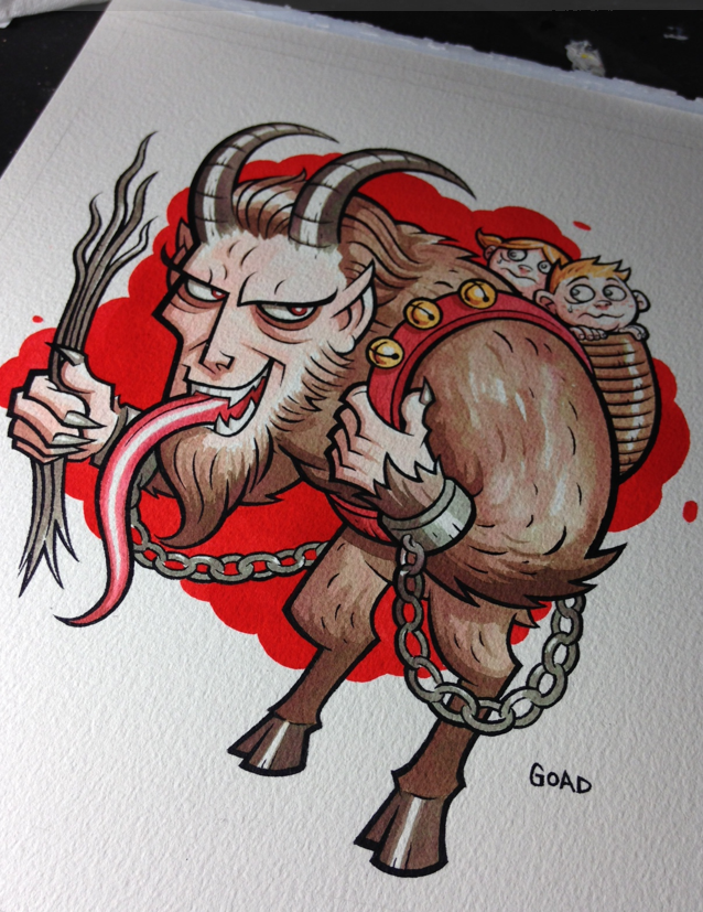
I'm going to try and show some more process pics of how I work and am going to start off with the Krampus illustration I did recently as a Xmas present for my mom. For this particular piece the materials I used were :
Arches 9" by 12" 140 lb. watercolor paper
Dr. Martin's Bombay black ink (line art)
Dr. Martin's Concentrated Watercolors - scarlet red, true blue, lemon yellow (coloring)
United Art and Education brushes #1 and #4
Dr. Martin 30 well palette
Krylon UV Resistant fixative spray
So first off I needed to sketch out my idea...this piece was kind of a joke one because of how much my mom loves Christmas - but at the same time really seems to like Krampus. But anyway, here's my first sketch and the start of my line art. Rather than just blowing the sketch up and then lightboxing it, I foolishly decided to just redraw it. But then again I'm real skilled at making things tougher for myself than I need to. The trickiest part of course was dealing with the chains. I'm a real stickler for things like that to look consistent.....

Next up I began inking. Unlike working on illustration board or smoother surface, the watercolor paper kept grabbing the brush, so a lot of it was sculpting of lines rather than single strokes. This part of the process always takes the longest, especially getting those little chain links.


Now's when the fun begins. I've said it before, but I usually start off every watercolor piece I do with a way watered down ink splat right in the middle it...you can see some of the collateral damage in the lower left. This is a little psychological thing I started doing a while ago to get me in the right frame of mind to work loosely and more expressively. It's kind of like "Oh , whoops I ruined it. Guess I can relax." (smile).
I only use my primaries colors and mix everything. This saves money and will teach you tons about colors. Now I can pretty much think of the exact color I want and know instantly about how much of each primary I need to achieve that. I know some people use those inks pretty much right out of the bottle whereas I make sure I water my colors down a lot. This allows me to build them up and avoid boxing myself in.


For the last part of it - the bright red background behind Krampus, I do use Scarlet Red straight out of the bottle...this is mostly so it looks consistent, something that would be next to impossible if I watered it down.
At this point I spray fixed the entire piece. One of the things about Dr. Martin's is you want to make sure you spray fix your piece with UV spray and if you're going to frame it, use UV glass if possible. I have some older pieces that weren't UV sprayed and hung in places where they were in direct sunlight and faded a lot over time.
For this piece, even after spraying it, the red background seemed to bright for me and I pulled it back a little, by brushing water on a section, then laying paper towel on it and picking up some of the ink.
Well that's all for the Krampus piece. Next up I'll show how I do my fake woodcut technique using masking fluid. Stay tuned.